Google regularly makes updates and tweaks to its index of the entire world wide web. However, this time it’s a huge change worth noting, one that will effectively create a brand new and separate index for mobile use. Google’s index is a collection of all sites and pages that are offered to users while searching. The new index will only contain mobile optimised information, and will be offered to searches from mobile devices. Whilst the idea makes perfect sense and seems logical, here is how it will change things.
The Mobile Revolution
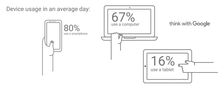
The mobile revolution refers to the adoption of mobile phones and devices by consumers for their browsing, online commerce and general use of the Internet. It is nothing new really, as this trend is several years old now and the numbers clearly indicate that mobile usage has reached and overtaken desktop computers. In fact a recent study by Google reveals a new revolution taking place, where about 40% of people are now exclusively using mobile devices for their Internet usage. Here is the full report.
Most digital marketers are acutely aware of these trends and have been adopting a mobile-first approach to their online investments, but this is not always the case. At Webcraft we have been recommending mobile responsive and mobile optimised websites to our customers for the past several years. Here is our piece from 2014.
In a mobile-first world, people expect answers at their fingertips. They turn to the nearest device to make a decision, learn something new, or get something accomplished.
--Google, Oct 2016
Google, Mobile-First
With this announcement, Google is effectively recognising the mobile usage trends by going mobile-first. The creation of a new index, that will exclude any content that is not mobile-optimised, means that your website and online activity will effectively vanish from Google searches. Not only will Google prioritise mobile over desktop content, but Google also indicates that the older search index will not be updated as frequently, a sure sign that it will be abandoned in the longer term.
Google has also been supporting (pushing) several new developments and technologies that will now suddenly take centre stage. Having a mobile-responsive website or version is the obvious minimum requirement, however many other factors will determine if your content makes it in the new age of mobile search. Page speed, just to take one example, is now a recognised factor within the Google ranking engine. Lightweight pages and a clean and mobile friendly experience and interface are back and all affect your mobile-friendly score.
Accelerated Mobile Pages (AMP)
AMP is a new website building technology that delivers and ensures that content is mobile friendly. It enhances the mobile browsing experience by delivering content optimised for the mobile consumer whilst providing the building blocks for mobile search indexing and mobile SEO. Google has been a key supporter of the new standard, and so are some of the major web browsers (Chrome, Firefox, Edge, Safari and Opera). AMP already ships with all these mobile web browsers on Android, Apple and Windows mobile devices.
Learn more: www.ampproject.org
In conclusion, we knew this was coming and if you have postponed your mobile-first plans, now would be a good time to catch up. It is a fact that Google (so will Bing by the way) will up the game in the coming weeks and whilst they have not announced a specific date, the wheels are already in motion.
At Webcraft, we help businesses take advantage of digital technology, including development of mobile-responsive and mobile-first solutions. Get in touch with us to find out how we can help your business today.