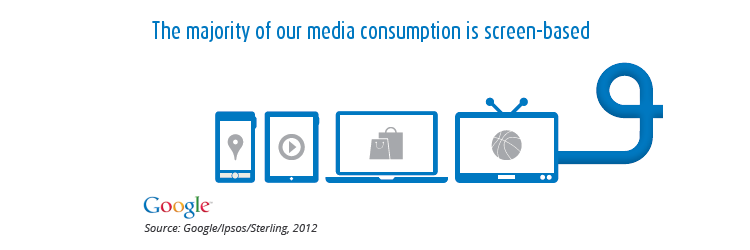
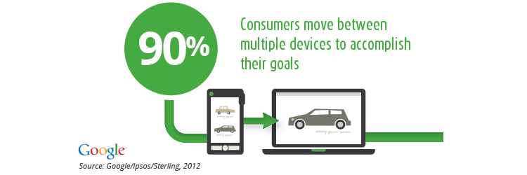
Statistics published by Google show a dramatic shift by consumers towards mobile devices such as tablets and smartphones. Nearly 40% of consumer internet interactions are now coming from mobile, with 90% of them using multiple devices at once.
The Multi-Screen Experience
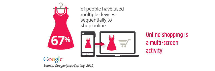
The above numbers suggest that people are engaging with websites in multiple ways and often interactions involve at least two or more devices. Google’s own statistics clearly show patterns whereby activities such as online shopping and planning a trip involve mobile searches, tablet browsing and desktop or laptop transactions. This trend is becoming so huge that it has started to take away viewers from traditional media such as TV. Yes TV is slowly (but surely) giving way to mobile devices and more consumers choose to get their content over the Internet, streamed directly to their device.
The Multi-Screen Experience is the realization and understanding of the sequence of interactions that consumers go through. This may involve several digital channels such as mobile, tablet and PC all at once. The basic idea is that this experience should be as seamless and smooth as possible.
Responsive Web Design, or RWD
RWD is a web design methodology that allows functional and media rich websites to work seamlessly across multiple devices. With thousands of very different screens available (mobile and non), a technology that can unify the web for the different channels can truly help build multi-screen experience. Evenmore, creating a single interface for multiple devices does save money in the long run as maintenance and updates are easier and faster.
A Scenario – Online Shopping
Linda is a busy girl, working long hours and comuting to work daily. She also loves her shopping and uses her train travel time to look for her next buy. She therefore uses her smartphone to access the mobile optimized site from her favourite store.
Next, she finds some free time at work to go back to the online shop using her office laptop. Presented with a seamless interface, the site remembers her recent product views and gives her recommendations based on her previous browsing. This time Linda is using her mouse to view details and photos of the items and trying on different colours.
Having made up her mind during the journey home, she grabs her bedside tablet to make the purchase just before dozing off for the night. Once again, the tablet presents a familiar site, with her pre-filled shopping cart ready to close her order. Using her touch screen she quickly flips through the checkout process and gets a great deal!
Why You Should Upgrade Your Website
RWD requires a skilled team to put together. It also will initially cost more to build, however RWD enables you to develop and implement a truly multi screen experience for your customers, that in the end will make the till ring and win new markets.
Webcraft uses responsive design to help businesses increase the effectiveness of their digital strategy by developing and improving the multi-screen experience.